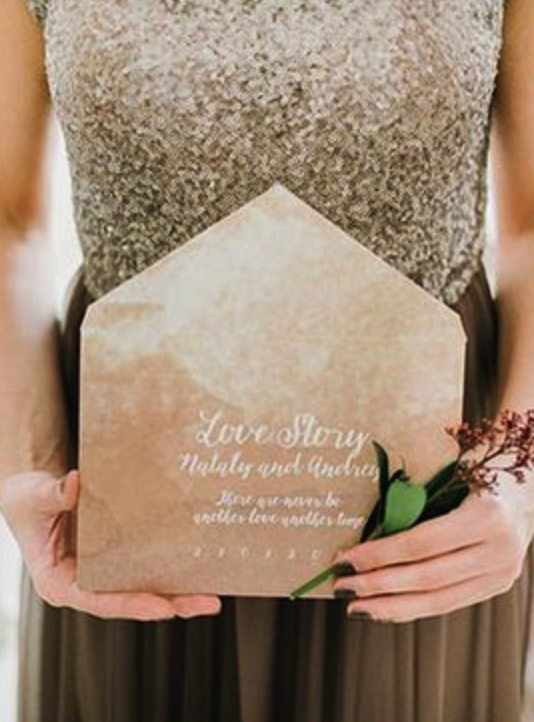
We’ve been waiting impatiently for Pantone’s announcement of 2018’s trend colours, and I can tell you, next year will be exciting. Let’s see what we can expect:
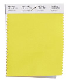


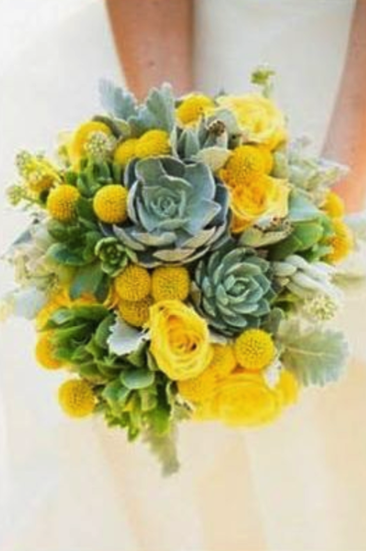
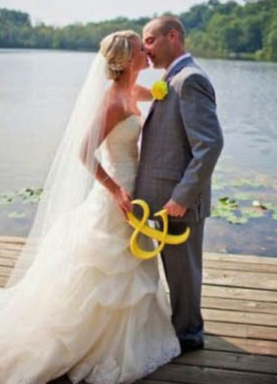
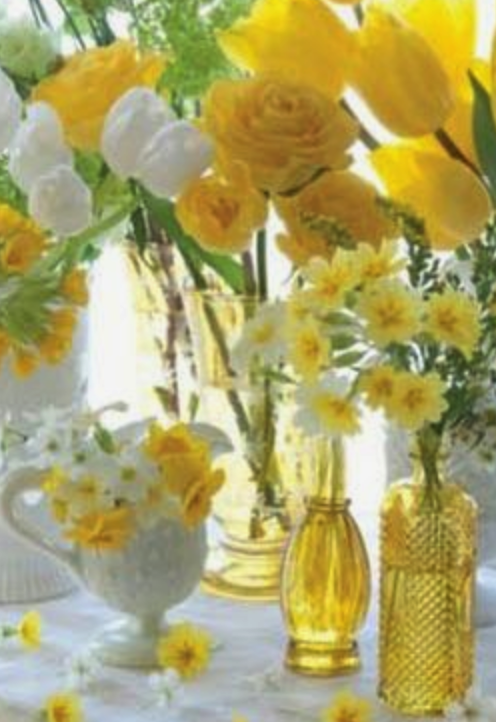

PANTONE 13-0646 Meadowlark
This bold, bright and confident yellow shade leads the 2018 trend colours. We recommend it to lively couples for a spring or summer wedding, with decorations using tulip, narcissus or even lemon.
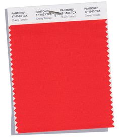

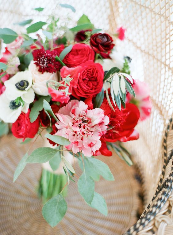
PANTONE 17-1563 Cherry Tomato
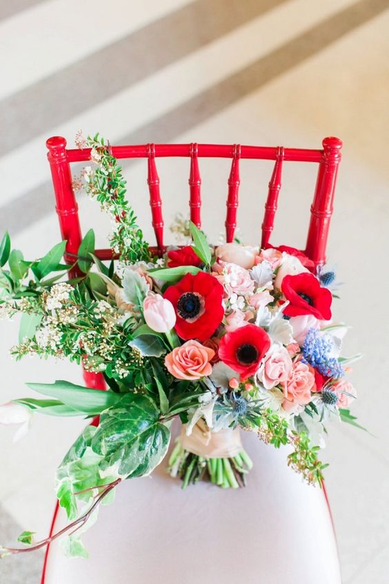
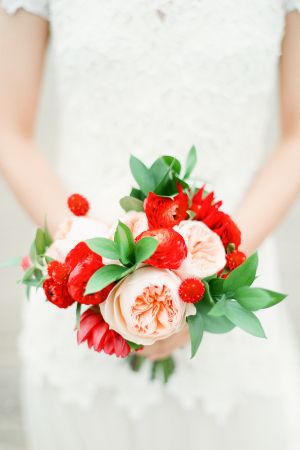
Powerful orange-red colour that radiates warmth and energy. Extravagant and bold, we recommend it for cheerful, outdoor weddings with seasonal flowers (poppy, rose, ranunculus or even tulip).
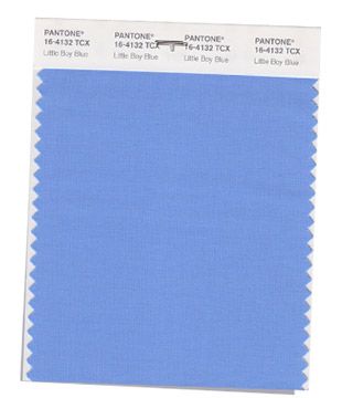
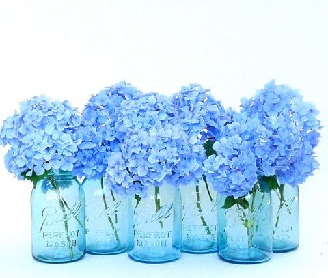
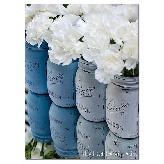
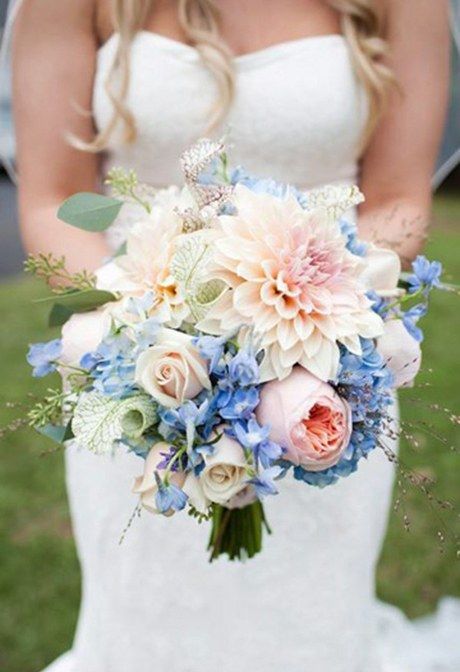

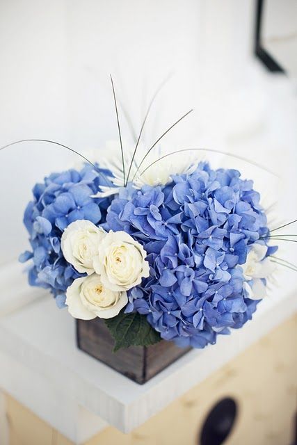
PANTONE 16-4132 Little Boy Blue
A symbol of the clear sky and purity and, if you are of the superstitious kind, it can provide that little touch of “something blue”. This colour is elegant without being the ordinary wedding shade. With lots of beautiful hydrangeas your decoration will be outstanding and stylish.
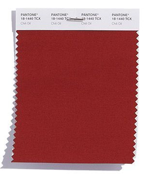


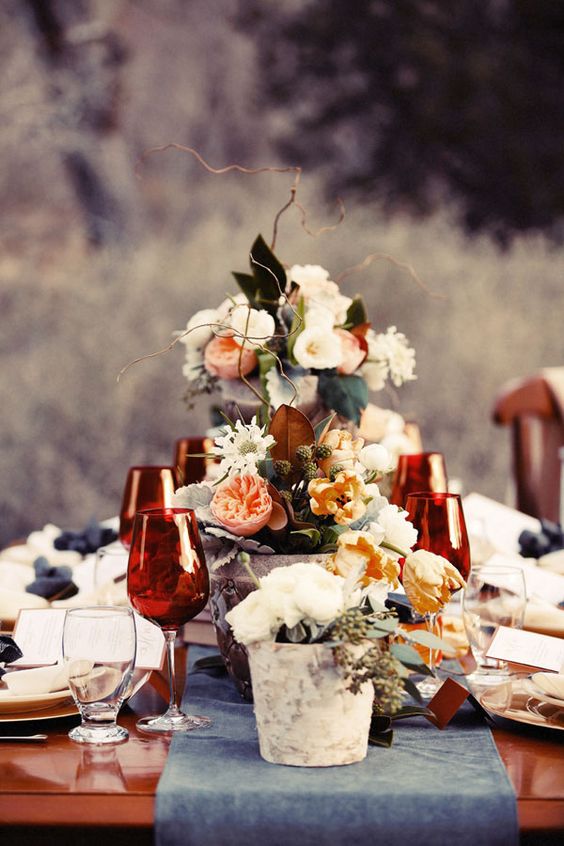
PANTONE 18-1440 Chili Oil
A warm earth colour that we recommend for autumn or winter weddings, but it could be great as an additional colour on a summer wedding also. Slightly rustic, it could be the main colour for outdoor or stylish but laid-back weddings.
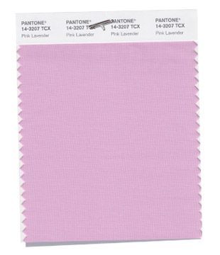
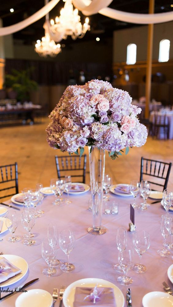
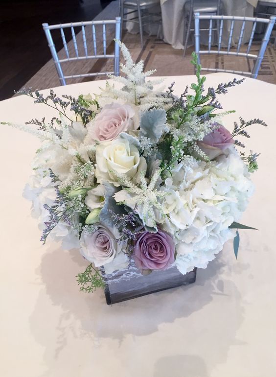
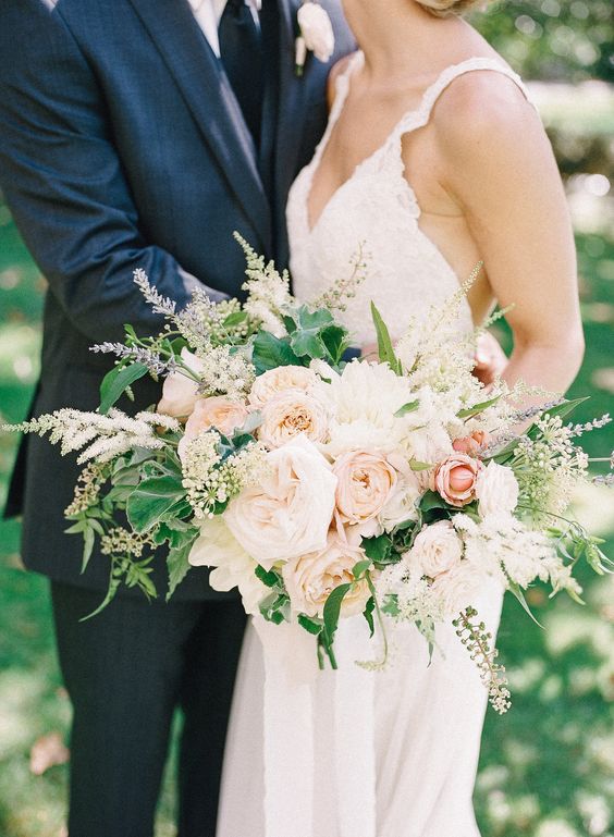
PANTONE 14-3207 Pink Lavender
Pink Lavender is a pleasing, light and romantic rose-purple shade. It’s perfect for real princesses for elegant weddings or as an additional colour if you want to go for a wildflower style.
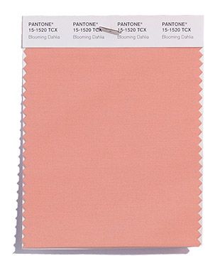

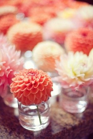

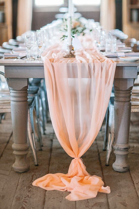
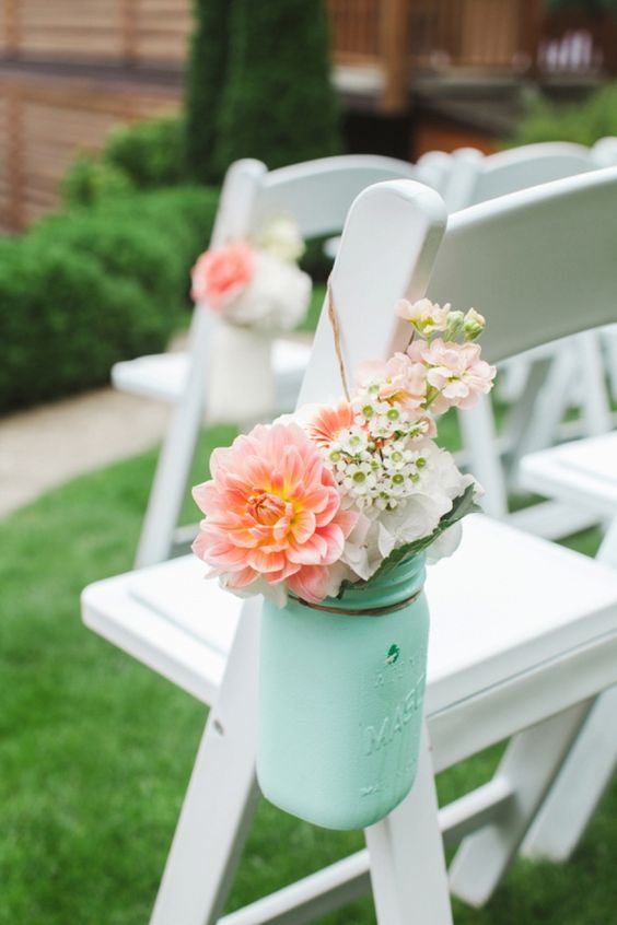

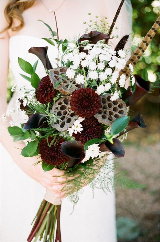
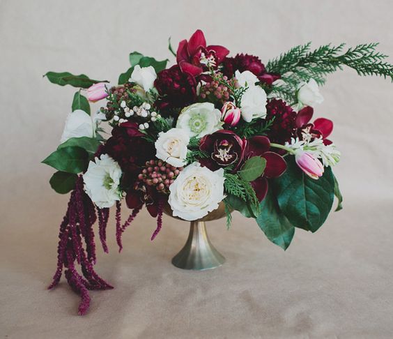
PANTONE 15-1520 Blooming Dahlia
A classic wedding colour that has been reappearing in various forms for years. For romantic brides it could be a great colour next to mint or white. When it comes to rustic style, blooming dahlia refines dark brown shades.

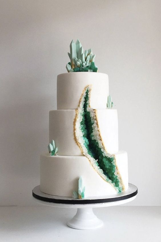
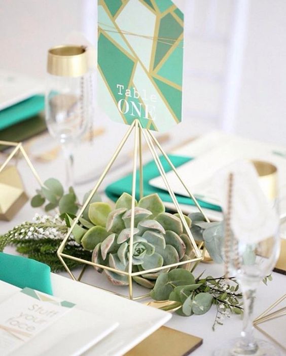
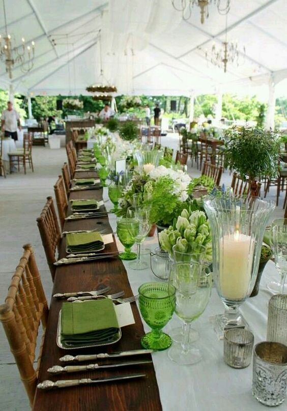
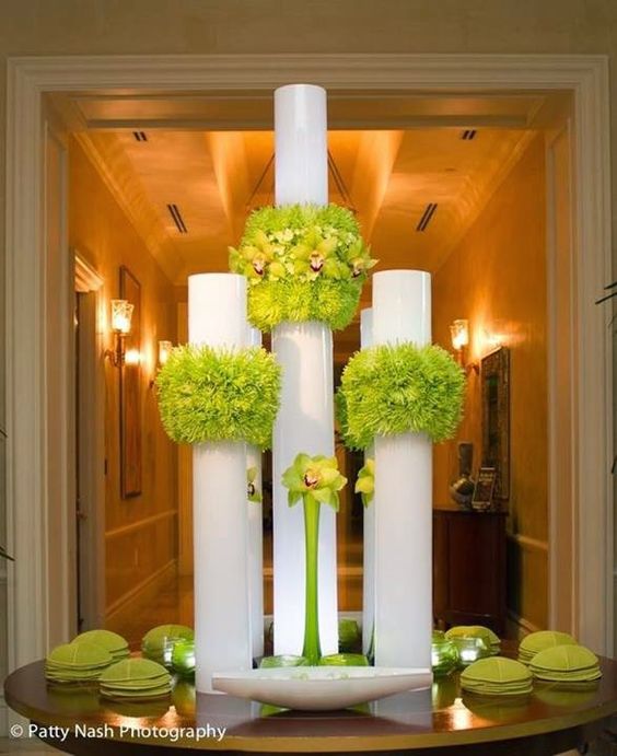
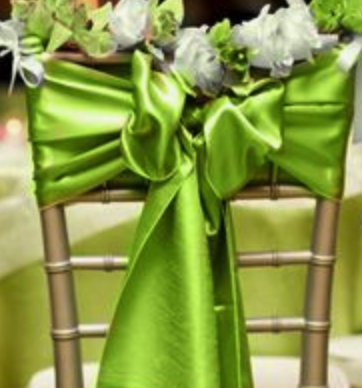
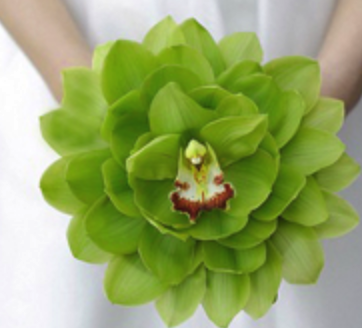
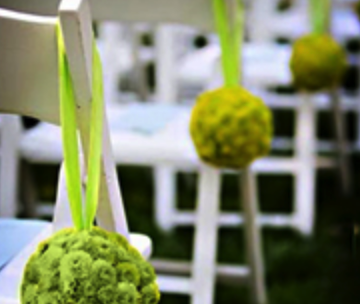
PANTONE 16-5533 Arcadia
Greenery burst onto the scene last year and green shades have been highly fashionable ever since. Arcadia is a more delicate mint-green shade that suits garden or even elegant weddings perfectly.


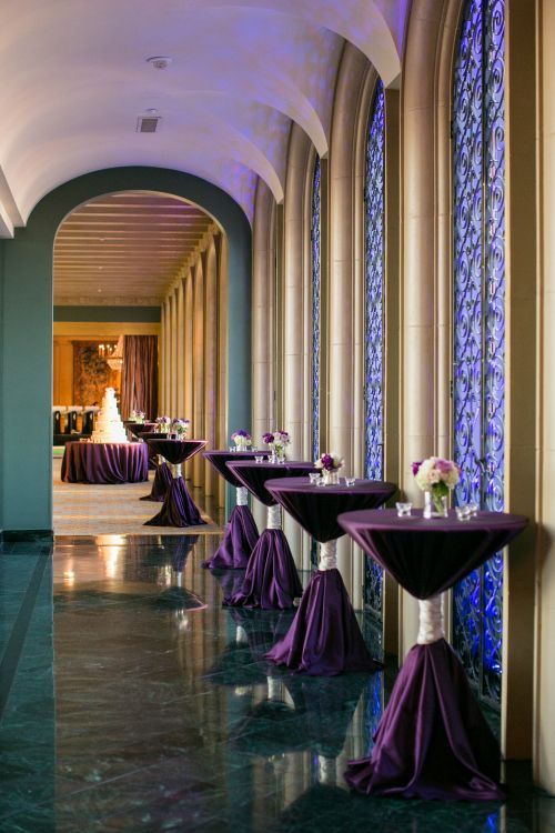

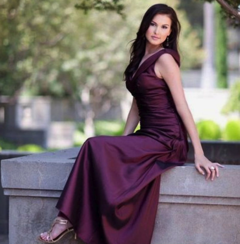
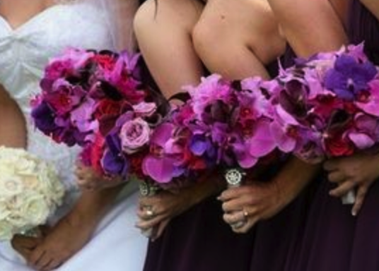
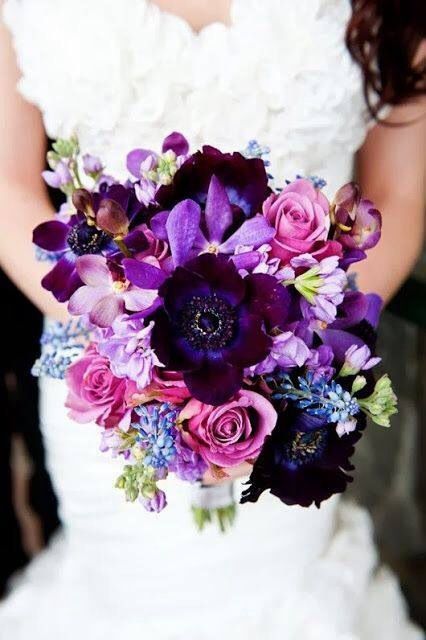
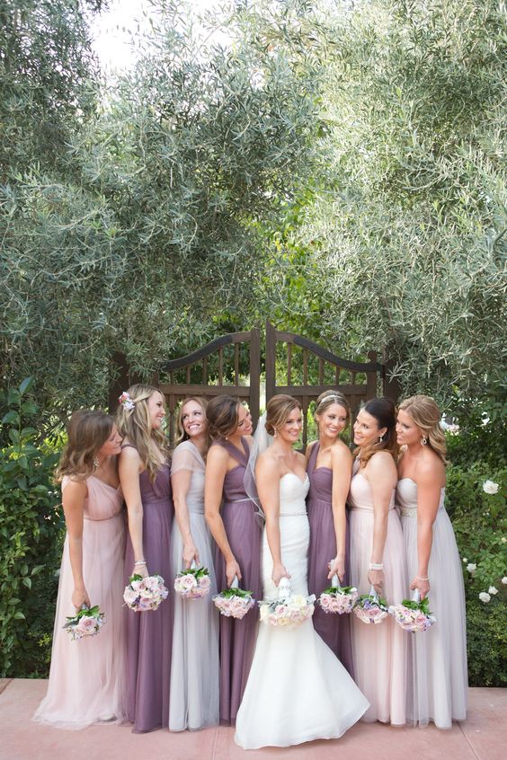
PANTONE 18-3838 Ultra Violet
Distinct and refined colour that can complement an elegant snow white or natural brown shade nicely. We recommend violet and hyacinth for a wildflower style, and orchid for classy weddings.
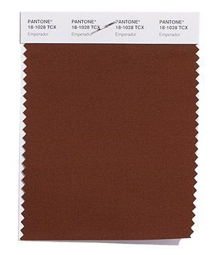
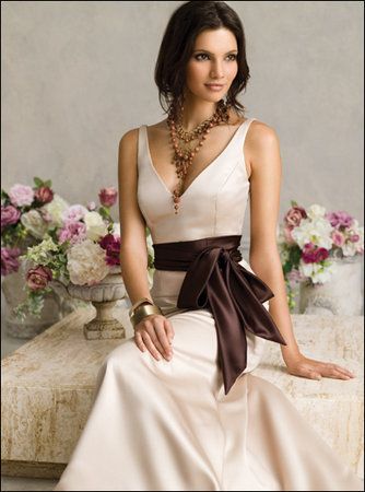


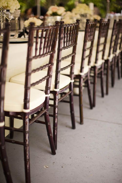
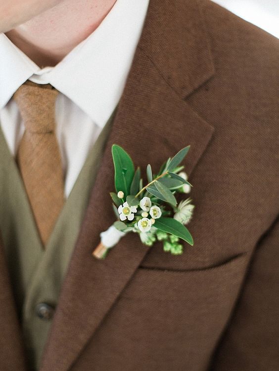
PANTONE 18-1028 Emperador
This chocolate brown is a classic, warm shade that can be your main colour for outdoor garden weddings. We recommend it with the fashionable chiavari chairs in brown colour.
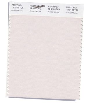
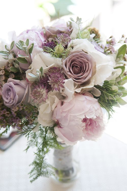

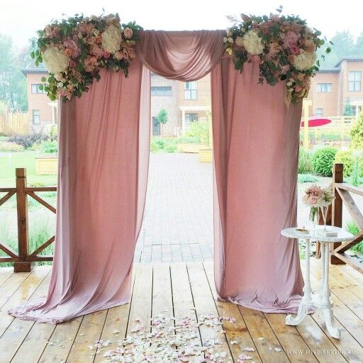
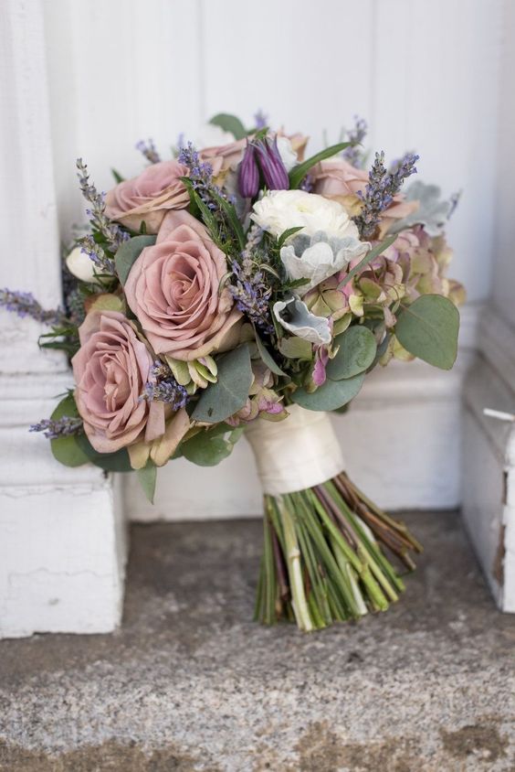
PANTONE 12-2103 Almost Mauve
Fine, princess-style, pastel shade that can be the main colour at boho or vintage garden weddings and that also suits grand castles. Roses, peonies and anemones are available in this colour.
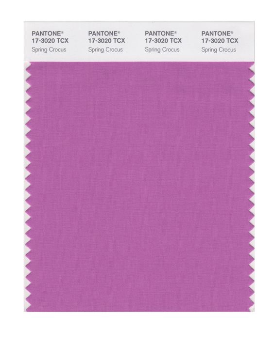


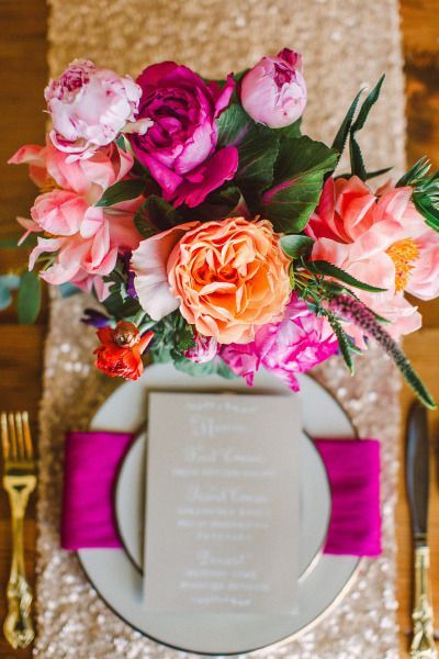
PANTONE 17-3020 Spring Crocus
Classic, romantic and expressive hue somewhere between purple and pink, which combines well with additional colours. It adds a distinctively classy feel with dark purple and pink, for example. Or why not create a fresh, colourful atmosphere by combining spring crocus with shades of orange, peach and pink.
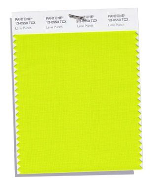
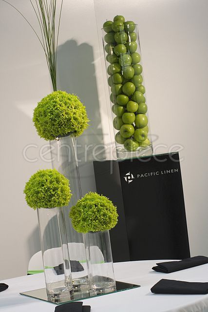
PANTONE 13-0550 Lime Punch
This is a cool colour for brave couples and we recommend it for youthful, lively weddings. Fruits like lime, orange and green apple can make funky decorations in addition to flowers.
KLASSZIKUS SZÍNPALETTA
Colours that have withstood the test of time and appear in wedding decorations year by year.
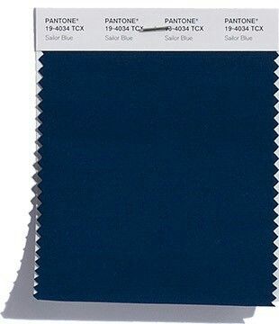
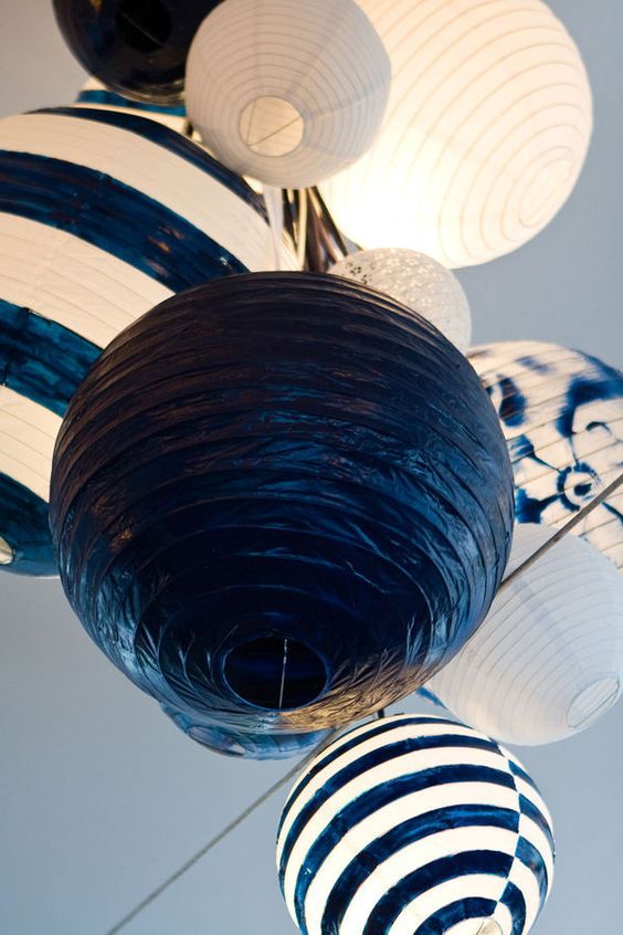
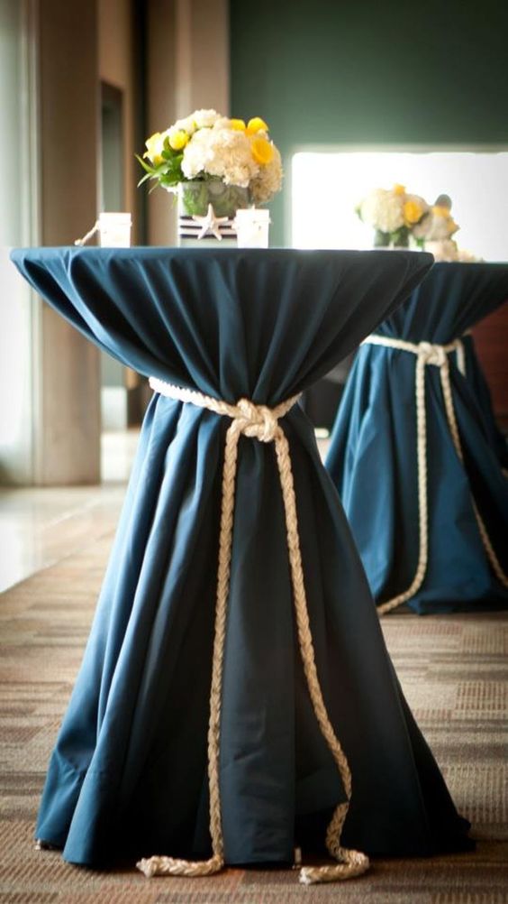
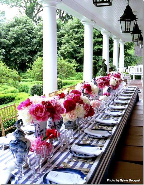
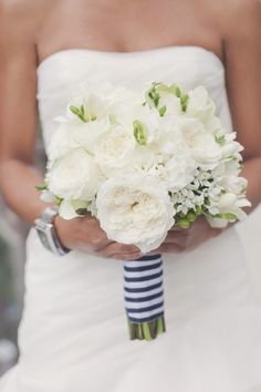
PANTONE 19-4034 Sailor Blue
Sailor blue has been a big favourite at weddings for years and we are also huge fans as it’s so easy to work with. We recommend it with white, gold or pink hues.
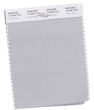
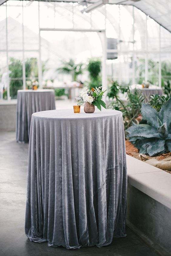
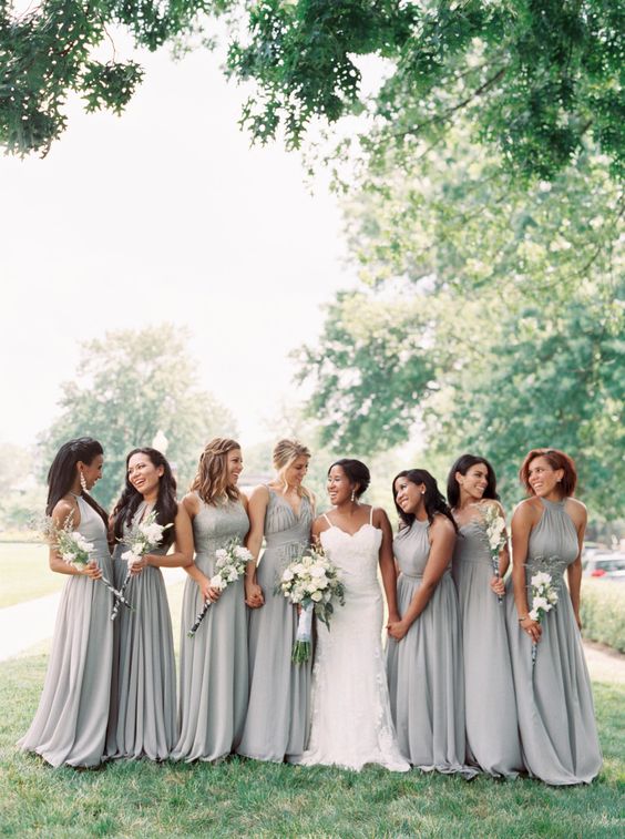
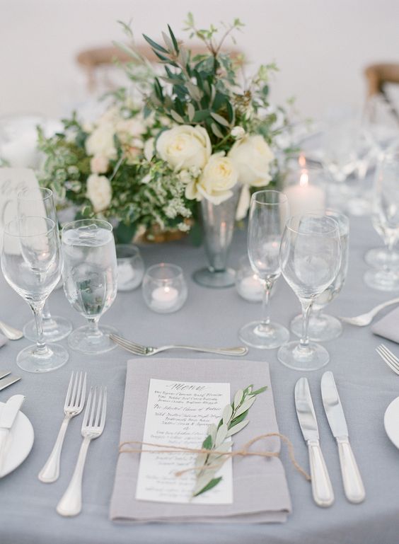
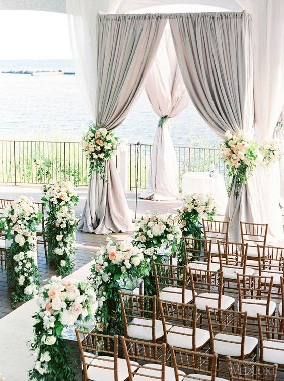

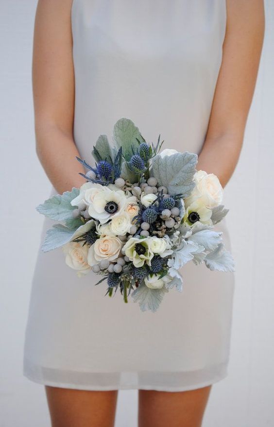
PANTONE 14-4202 Harbor Mist
This medium grey goes perfectly with every colour. It is classic with white, romantic with grey blue hues and creates a lovely garden atmosphere with greens.
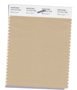
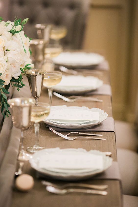
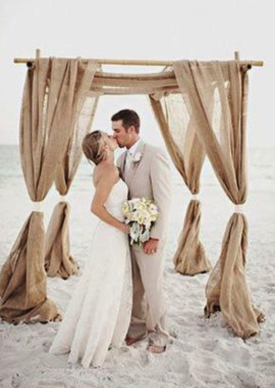
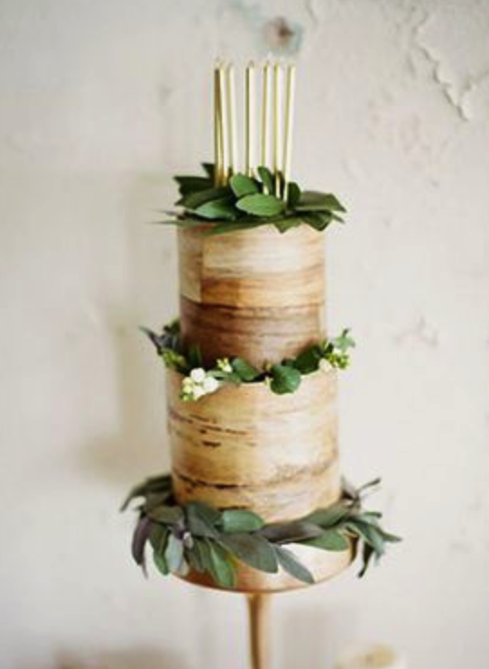
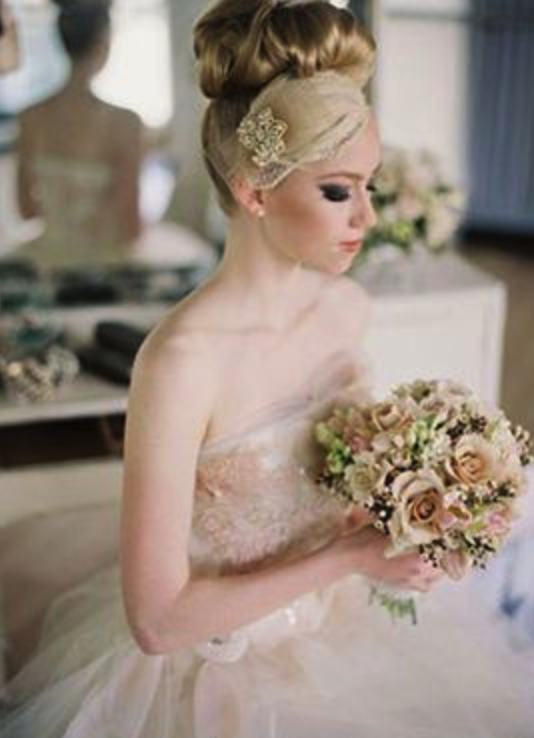
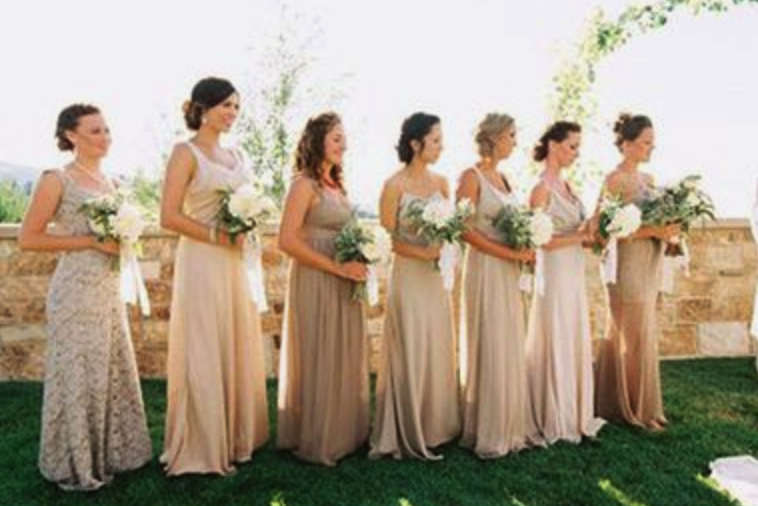
PANTONE 15-1214 Warm Sand
This warm shade of sand goes well with any additional colour.
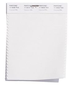

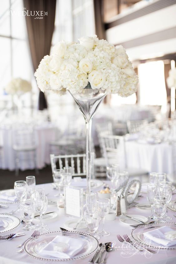
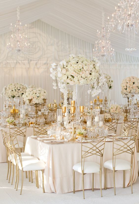

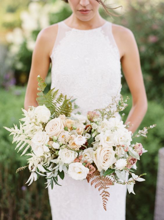
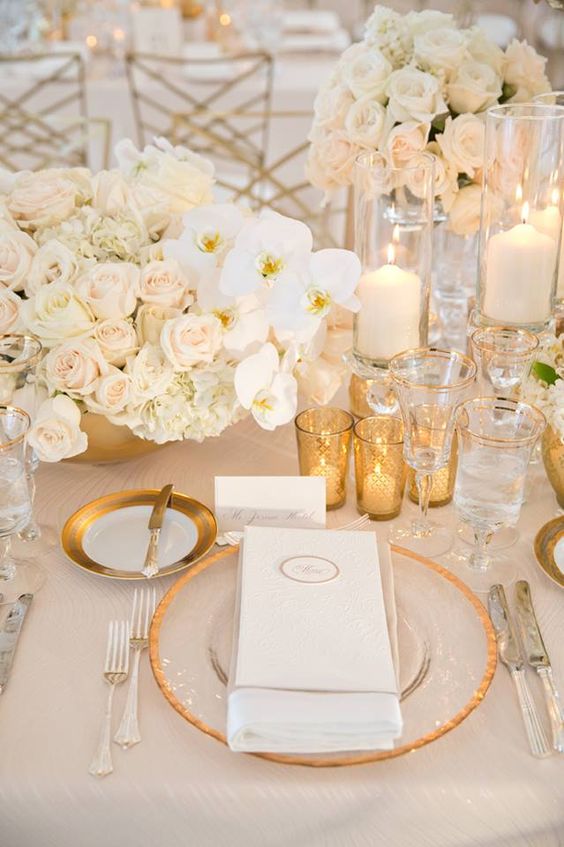
PANTONE 11-0608 Coconut Milk
Shades of white make clear and simple decorations and never go out of fashion.
We hope you will also find your favourite in this colourful selection.
We are looking forward to spring and the start of the new season!
This post is also available in: hu (hu)